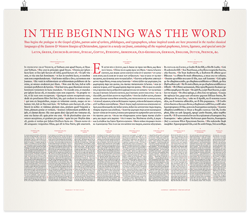
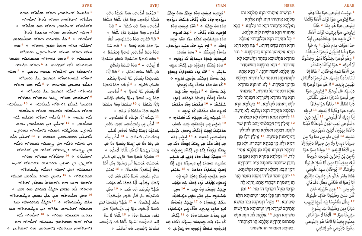
Dodecaglotta is my polyglot Bible typography project, working towards a bibliophile edition of holy Scripture, in twelve classical languages (Greek, Latin, Syriac, Coptic, Ethiopic, Armenian, Georgian, Church-Slavonic, German, English, Dutch, French), designed to the highest standards in multilingual parallel typesetting. ¶ This broadsheet of the Prologue to the Gospel of John is Dodecaglotta’s first edition. It serves both as a type specimen of the fonts that are in the make, and as a proof-of-concept for the twenty-first century oecumenical evangeliary codex I envision.
Typography is the art of designing the shapes of words to illuminate the ideas they carry, and to conserve our valued texts for posterity. Sacred scripture is written in many scripts, read in more languages, and the typographer’s ultimate challenge is to orchestrate the communion of this manifold multilingual magnificence within the constraints of the printed page. The polyglot Bible is typography’s crown jewel.
Dodecaglotta is a neologism, coined from the Greek, modeled on ‘biblia polyglotta’, and is equivalent to something like ‘duodecilingual’, or twelve-tongued: the same text in twelve languages. The languages of Dodecaglotta are the classical voices of the christian Oecumene, from the Orient to the Occident: the community of liturgies in the East and the West. Twelve ecclesiastical traditions in eight different scripts and writing systems, each of which feature their own calligraphic particularities and typographical challenges. In celebration of the Incarnate Word, and with the help of linguistics, statistics, high-tech software & computer algorithms, we may try to seek conciliation with the craft of ancient scriptoria and this great typographic tradition that is the polyglot Bible.
Twelve Languages
The Holy Bible is the most published book of all times and scripture has been translated in over 2,500 languages throughout the world. Many of those languages may even delight in a wealth of many different translations to choose from. The English-reading world alone has access to over hundred (>100!) different complete translations, both Old and New Testament. To make the number even larger, these translations are multiplied by the factor of text editions: with or without sectioning and verse numbers, with or without apparatus, cross-references and concordances. These editions, in turn, have been printed in several different form factors and page layouts: cloth-bound or in leather, portable pocket edition or desktop reference edition, &c. &c.
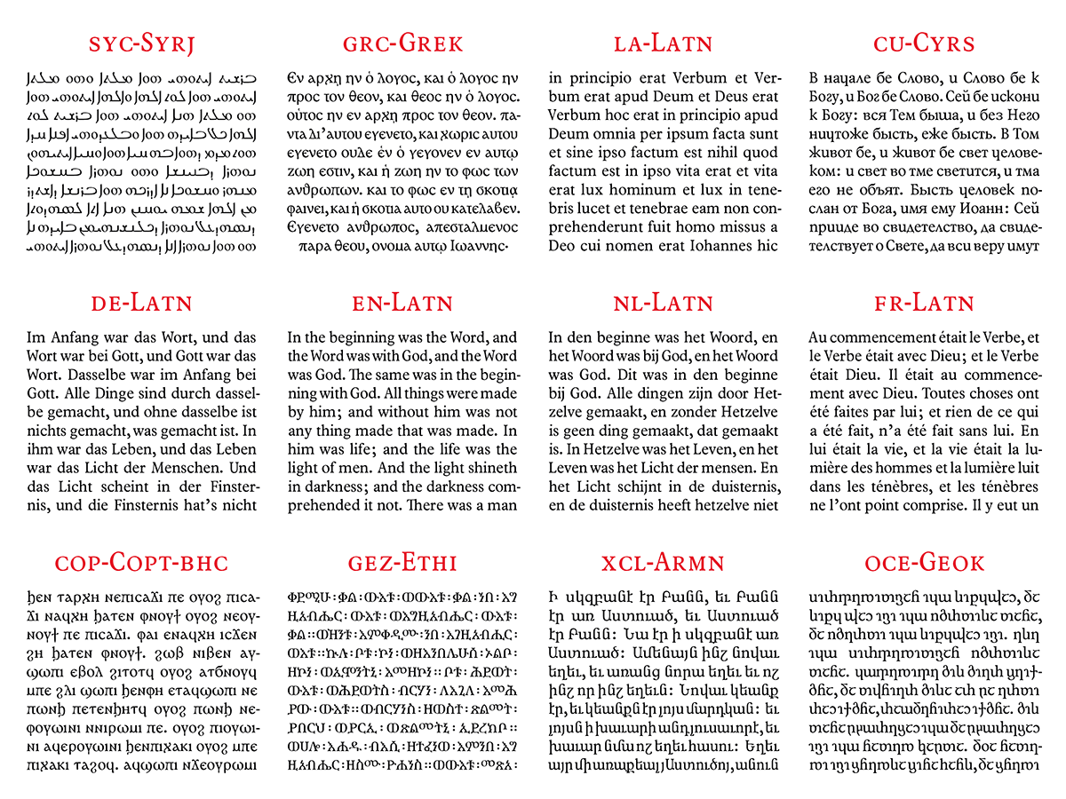
To further complicate matters – but not without treasuring, at once, mankind’s diversiform virtuosity – the vowels and consonants of the spoken word can be written (and printed) in many different scripts. Originally, almost all languages have been written in their own particular scribal hand, but most have converged to the same letter shapes. While the Luther Bible was first printed in Schwabacher letter, and later editions have been typeset in Fraktur, today, German is written in Latin ‘Antiqua’. Likewise, the baroque gothic blackletter of the 1611 English King James Bible and that of the 1637 Dutch Statenvertaling have nowadays been replaced with the ‘roman’ type style. Some languages, like Greek, however stand strong and are still written in their own endogenic alphabet. Then again, some others, like Syriac-Aramaic, are written in up to five variant scripts or writing systems. The Slavonic Bible, too, is still being printed in both Glagolitic and Cyrillic, while the Cyrillic alphabet itself is rich with alternate shapes for the same letters, depending on local typographic tradition, as is the case with Bulgarian and Serbian.

For the sake of the christian Oecumene, I choose to make a polyglot edition with four major global languages, and eight less widespread, but highly important classical languages: the eight sacred liturgical voices of Christianity, alongside the four historically most significant translations of the Reformation. For each of them I have selected the canonical text editions of their respective traditions from the best sources available in the public domain.
Type design
Language cannot be woven into text without the weaving threads of the alphabet. Letters come in all shape and form, and it are the tiniest of details (like stem weight and proportion, spacing and placement of serifs, usage of ligatures and contextual alternate sorts) that make the quality of a typeface, and consequently the grade of the textile that is fabricated with it. I have furnished my already elaborate private workhorse typeface with the letter forms of exceptional scripts, which are rarely found in digital fonts.
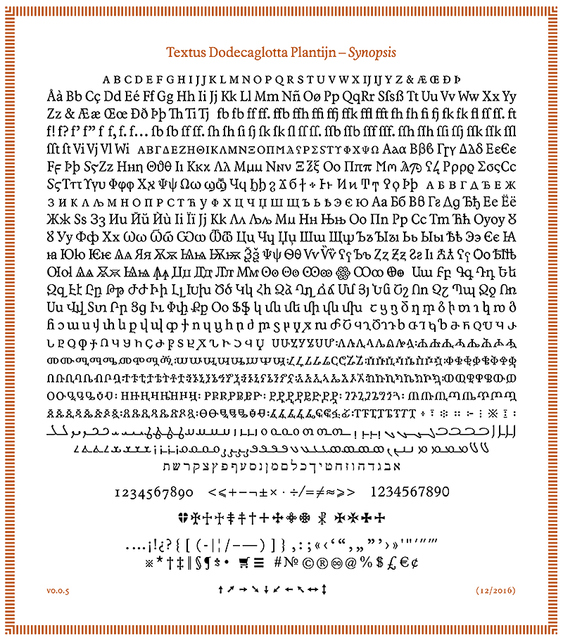
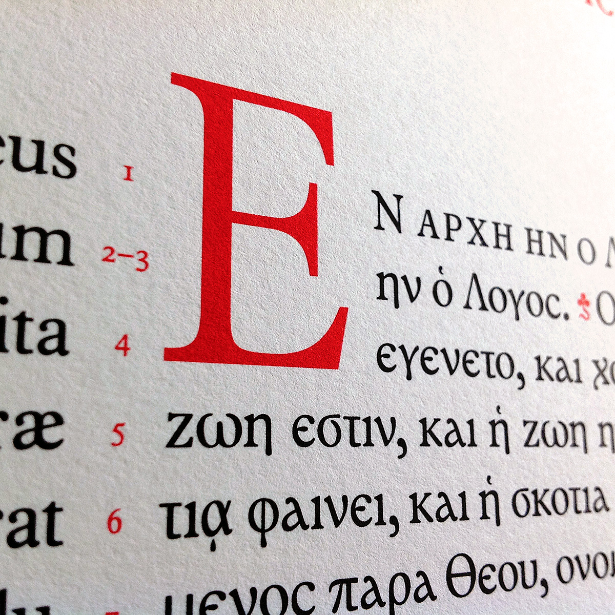
Especially for the Dodecaglotta I have designed a unique rendering of the Greek alphabet, inspired by Byzantine scribal tradition, in contrast with and in addition to the nowadays more conventional cursive form. The Greek uncial surely is closer to the Coptic script (which I have, of course, added as well) and better matches the colour of the Latin and Cyrillic.
Tradition has it that Saint Mesrop not only translated the entire Bible into both Armenian and Georgian, but also devised two completely new alphabets in order to be able write down his translations. The Textus Plantijn typeface covers both scripts. Moreover, especially for Dodecaglotta, the original, ancient version of the Georgian alphabet was drawn. While modern Georgian is written and typed in Mkhedruli script, tradition requires that liturgical texts in Old-Georgian – and Holy Scripture by excellence – are set in Khutsuri. Hence, I have designed complete sets of Asomtavruli and Nuskhuri, in addition to the secular script, thereby honoring the wishes of Patriarch Ilia II of Georgia.
The Syriac text has a similar demand: Neo-Aramaic can be written in Hebrew letters, Arabic, or in three different styles of the Syriac script. Thus I engaged in yet another scholarly adventure and have added Serto and Estrangello to my fonts. (Since Eastern Syriac nowadays is commonly written in Arabic script and has a far less important typographical tradition, I have decided – for now – to leave out Madnhaya.) It’s my first thorough experience with right-to-left typography, too…
The text in classical Ge’ez (an extinct language, Abyssinia’s equivalent to what is Latin in Europe, today used only in liturgy) is a real tooth biter: the Ethiopic syllabary requires some six hundred ‘fidäls’, glyphs, with cheirographical features that are difficult to tame into a well-belanced typeface. In order to do so, I have been geeking out with paleotypographic research, so as to make sure not to distort the script’s underlying ductus and stroke build-up. Meanwhile, I have drawn almost all graphemes that are to be used in Dodecaglotta, but the set still needs a lot of work before it will be completed.

Microtypography
At the atomic level of the letter shapes I can now rely on my typeface and its built-in typographic software. On the molecular level, all these languages also require the application of proper hyphenation, complying with orthography and morphological rules. Hyphenation and language-specific justification settings are of paramount importance, especially when the measure of text columns is narrow, which compels us to pay special attention to word spacing and line breaks.
Hyphenation and language statistics
We must deal with eight different scripts, which each have their own particular typographic ‘couleur locale’. Even the five languages in Latin alphabet vary in color because of their different orthographies, average word lengths, and distinct use of ascender and descender letters. And yet we must manage to retain our page, over-all, as even and measured as possible.
Therewithal, for the sake of the polyglot, we need to secure that the verses of the different translations remain parallel, and lined-up with each other, as well.

This is no trivial sinecure, for some languages, like Georgian, run considerably more lengthy, while other scripts, like Hebrew, have an extremely frugal set width. With the help of linguistics and statistics, we can do wonders indeed…
Mission
It is my goal to print a modern evangeliary, containing all four gospels, in twelve languages, as a bibliophile fine press edition – a true codex of the third millennium.
Dodecaglotta is not a corporate business venture. It is the pet peeve side project of a passionate individual. I cannot make a living from paleotypographic geekery and alcove text exegesis. But I am a classical scholar and passionate typophile in heart and soul, time and again drawn towards letters in all form and shape. The history and manufacture of the polyglot Bible is my years-old fascination. When I can entertain (maybe even instruct and delight) my fellow human beings with the scribal makings of my digits, I find myself incited to further pursue this happiness that is in the enduring solitary study of the word and its inexhaustible shapes. So, with your help and encouragement, I may step-up this little side project and expand Dodecaglotta to comprise the complete New Testament, adding to the gospels the Acts of the Apostles, the Epistles, and the Book of Revelation. Eventually, and if Providence permits, I might even aspire to typeset the entire, twelvefold Bible…
You can help Dodecaglotta succeed, anyhow. The broadsheet poster of St John’s Prologue is a proof-of-concept, showing what Dodecaglotta is all about. If you want to support the Polyglot Bible Typography project, then do order your copy today!
My pledge
The famous French typographer (and inventor of the eponymous typeface classification system) Maximilien Vox (1894–1974) wrote the following vow for the purpose of the ‘Compagnons de Lure’, his fraternity of typophiles:
Par le verbe incarné, par l’Alpha et par l’Oméga, par la montagne de Lure, je fais vœu de mépriser le lucre, de renoncer la gloriole, et de servir l’esprit.
Such a noble, platonic command! (Typographers are of a peculiar kind ;-) To despise the Mammon, to renounce vanity: the typographer shall be a servant of the Idea, his letters shall be devoid of idle garnish, so help him the Word Incarnate… Thus, I too shall take this Hippocratic oath of our craft as my vow, and commit to the following pledges:
- Research — I will regularly post full write-ups of my research, sharing a knowledge trove on multilingual typography, non-Latin type design, text encoding standards, and the cultural history of the Bible.
- Publish — If demand permits, I plan to design, print and issue incremental editions of Dodecaglotta, and offer them for purchase at affordable price points. At a previous call, I had hoped to find enough interested people to procure for the production of a Nativity edition on the occasion of Christmas 2016. The design is done, and I will publish the edition next year, anyhow. Special installments for Easter (pericopes of the Passion) and Pentecost are considered too, as is a multilingual edition of Our Lord’s Prayer in the good old printer’s tradition of the Oratio Dominica.
- Design — Typeface design is an ongoing effort: fonts become better with age, by using them in challenging typesetting projects. Only then those tiny flaws become apparent, which would be overlooked in gloriole graphic design wannahaves. Oftentimes slight adjustements must be made, new ligatures are to be devised, and alternate glyphs for contextual replacements in pairs of letters that would otherwise form awkward combinations of unevenly distributed space. Nudging and perfecting fonts is a thankless and tedious work of labor. Nevertheless, I promise never to be satisfied with good-enough quality and always strive towards a worthy carrier for the Word only.
- Code — The modern-day typesetter must be a software programmer as well. Frequently I write programs to edit and batch convert a million words of electronic Scripture, scripts that for example convert Mekhdruli to Khutsuri encoding, or that gradually strip off Greek diacritical marks, or fix punctuation and copy-editing errors. I promise to publish such tools as command line utilities and npm modules, for everyone free to use.
- Opensource — I have been preparing and formatting thousands of files, containing the text of the Bible in its many translations, to bring them up to the current state of the art in electronic text editions, following best practices in computer standards: Unicode UTF-8 character encoding, using CommonMark markup, tagged with BCP-47 compliant language and script identifiers, and put them under Git version control. Soon, I will start opensourcing the files and publish the repositories to Github, under the most permissive Creative Commons license (PD).
Your support
Your support is very appreciated. Purchasing one or more copies of the letterpress broadsheet is the most immediate way to encourage me in further pursuing my mission to publish a complete polyglot Bible. Revenue from poster sales helps me paying bills for font development software, lithographic film, proof impressions, specialized reference books, critical text editions and research. Besides buying the posters, there are many other ways you can help with Dodecaglotta:
- Spread the Word — Tell your friends and professional relations about Dodecaglotta, especially people who love letters, languages and typography, or who have a keen interest in religion or history.
- Make someone happy — Surely, the Prologue poster would make for a suitable gift, or a Christmas present, too. Your graphic designer friends, bibliophiles, philologists and language enthusiasts. Your colleagues from Palestine, Lebanon, and Syria, Greece, Ethiopia, Egypt, Georgia and Armenia. The pastor of your local church, your confreres or fellow clergymen, your Farbenbrüder and commilitones. They will all regard Dodecaglotta as a gesture of good taste and a select testimony of faith.
- Feedback — Human effort is fallible. I will be very happy when you would draw my attention on design flaws in my fonts, or if you would find some letterforms to stand out as unusual or rightout wrong. I look foreward to feedback especially comming from native readers of Cyrillic script, Armenian, Georgian, Syriac and Ethiopic.
- Help preparing the texts — Since I will opensource the text files, used in Dodecaglotta editions, anyone interested will be able to revise the text, and maybe even help improving them by amending and making ‘pull requests’. I know Dutch, English, German, French, Latin and Greek, can read a bit of Cyrillic, and manage to decipher other scripts. But surely enough I would more than thankfully accept any recommendations from byzantinists and orientalists, syriacists and ethiopianists, people knowledgeable in Coptic, Armenian and Georgian…
Offset poster
- 500×600 mm (≈ 19″69×23″62)
- offset lithography
- printed in two colours (black + Bible red)
- 150g/sqm Munken Pure Rough archival paper
Letterpress broadsheet
- 500×600 mm (≈ 19″69×23″62)
- letterpress on a 1963 Heidelberg KSB cylinder press
- printed in two colours (black + Bible red)
- 225g/sqm Zerkall Echt Bütten Nr 972 cotton rag
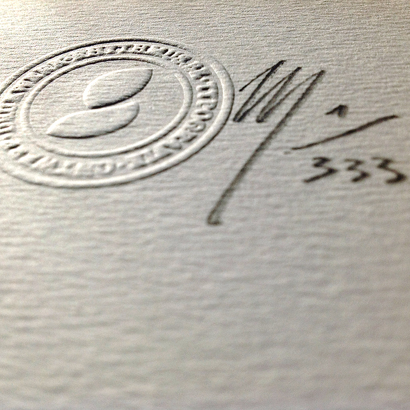
- limited edition of 333 numbered and hand-signed copies
* Price for a single copy excluding packaging and shipping. Invoices are issued on request.
† Special introductory offer for the first fifty copies sold (##34–83). Subsequent sales of the letterpress broadsheet limited edition will be at € 333,00 a piece.
The offset posters are immediately available for shipping.
The letterpress broadsheet is still in production.
For customers from the European Union prices include 21% VAT (value added tax). For shippings to countries outside the EU, additional taxes or customs duties might incur.¶ Approximate freight costs for standard shipping within the EU are € 15,00; € 20,00 overseas. Packaging is solid; sheets are rolled up and boxed in hardboard poster tubes. A single tube can contain up to four posters, allowing for profitable shipping of volume purchases.¶ Orders are processed within one week. Standard mailing within the EU usually takes between two and ten business days. Shipping to the rest of the world may take up to eight weeks. Parcels are not insured, nor trackable. If you want faster shipping and/or insurance, please mail me.

Motivation and Purpose
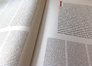
In 1573 the Antwerp printer Christopher Plantin finished his Biblia Regia, an immense scholarly and typographical undertaking, which started five years before, in 1568, when it was commissioned by the catholic king Philip II of Spain, who sent his theologian Montano to Antwerp to watch over the editorial preparation of the text. But Philip also sent the iron Duke of Alva to the Netherlands, for it were the sad days of the European wars of religion, which resulted in the schism between the catholic South and the Reformation in the North. The Low Countries, then, were the prime battle ground, and to this day my and Plantin’s Dutch homeland is on the fault line of the Occidental divide.
As were many intellectuals of his day, Plantin was a convinced christian, sincerely seeking Truth through the means of grace that were offered by his era. He was married to a devoted catholic wife, but he also had many calvinist friends and business partners. His homestead was sacked many times, and at many occasions Plantin could barely save his presses. To his even greater misfortune, the king failed to pay the promised price for his Bible, leading to the printer’s near bankruptcy. Amidst war, upheaval, unrest and violent fanaticism, Plantin overcame the ravages of politics and troubles of commerce. He evinced that faith, hope, and love, which drive the stricken souls of artists, scholars and believers, may prevail over cynicism, barbarism, and brutality.
Though Christianity remains divided to this day, what yet remains are these huge exegetical and typographical achievements of ages past, bearing witness of our common creed; works of art which through their intellectual beauty still inspire the spirit of communion through the Word they make visible to the world. Today we may stand on the shoulders of giants, rely upon their centuries-old work and, with the help of modern technology and computers, may even try to emulate the fruits of their devotion, thus tributing ourselves, in our blighted but abundant day and age, to our common heritage and tradition, persevering to bear witness of the Word in a profane world that has been feverishly changing and will keep doing so, a lot.
I begun the Dodecaglotta project to find spiritual repose and intellectual solace through the hardships of entrepreneurship. It is my hope that kindred souls, my brethren, may find a likeminded joy in the beauty of the typeset Word.
I was raised a Roman-Catholic, in my native Brabant, and trained as a student of Latin and Greek at the university of Leuven, my alma mater, where Erasmus instituted the collegium trilingue. I earned bachelor degrees in classical philology, archaeology and philosophy, magna cum laude, and a master’s and doctoral degree in art history, egregia cum laude. During my sophomore years, I was, v. ‘Ludwig’, Chargierte, mDA, der KAV Lovania zu Löwen and the fraternity’s resident typesetter. At the university of Antwerp I did post-doctoral research in computational linguistics, with a particular interest in mediaeval paleography. Also in Antwerp, my hometown, I graduated as a typographer, summa cum laude, from the Museum Plantin-Moretus, Unesco World Heritage, after which I continued as a self-taught type designer and proprietor of Rhythmus.be, a letterpress printing office. I was a professor of graphic design and typography at various university colleges, before eventually settling down as an independent book designer. Last year, I co-founded Textus.io, a Web start-up focusing on digitally automated high-quality typesetting, and dedicated to the preservation of mankind’s literary heritage.